Category

Design

Category

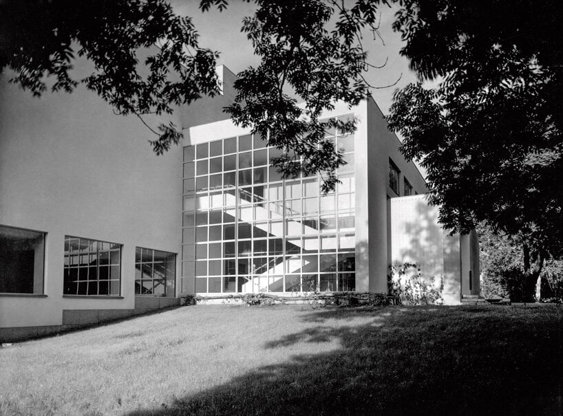
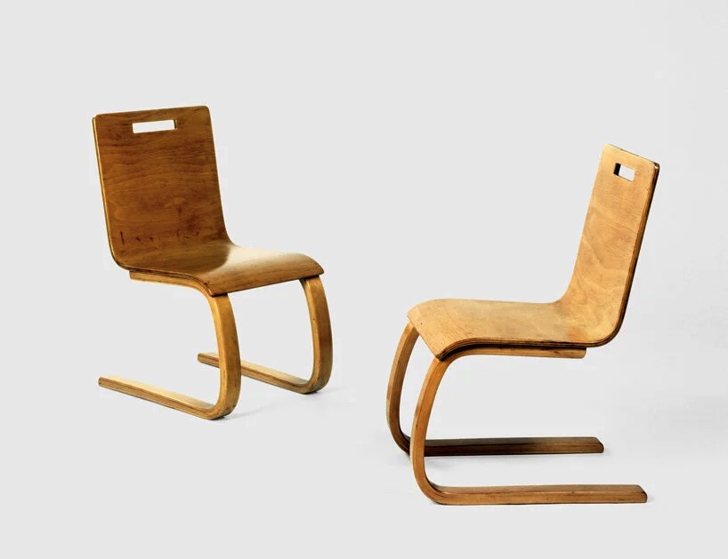
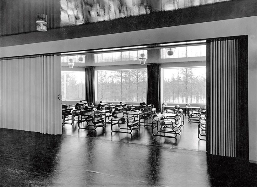
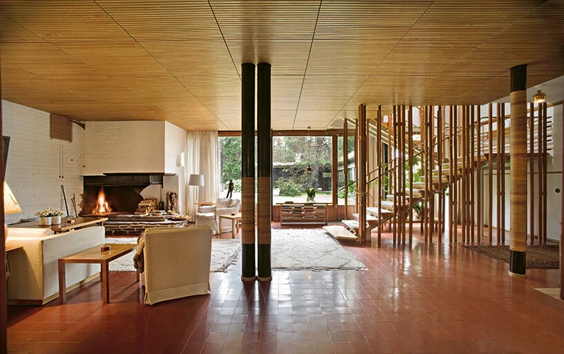
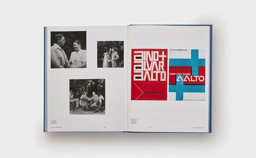
Aino + Alvar Aalto: A Life Together is an invitation for readers to delve into the exceptional partnership and creative odyssey of two remarkable individuals who have left an enduring mark on the realm of design. This publication serves as a tribute to commemorate not only their remarkable accomplishments but also the profound love that ignited their artistic endeavors, granting us invaluable insights into their remarkable contributions to the world of art and design.

Within the pages of this book, Aino + Alvar Aalto’s influential design projects are brought to life through an array of sketches, photographs, and illustrations. Moreover, it is a heartfelt exploration of their life journey, from their formative years to the untimely loss of Aino in 1949. The book unfolds a captivating visual narrative that includes treasured photo albums showcasing their travels, encompassing everything from family vacations and cross-country road trips to international sojourns during the tumultuous era of World War II. Additionally, the book delves into the treasure trove of archival letters exchanged between Aino and Alvar, as well as their correspondence with family, friends, and colleagues. These epistolary gems offer a profound understanding of their personalities, thought processes, and motivations, all expertly framed within the historical context meticulously provided by Aalto-Alanen in his accessible narrative.

As Aalto-Alanen eloquently states in the foreword, “Through these letters, we are granted a rare opportunity to eavesdrop on the authentic voices of Alvar and Aino themselves. They allow us to witness, in their own words, the contours of everyday life experienced by this extraordinary couple during their shared years, and to comprehend the intricacies of their musings.”

www.phaidon.com/store

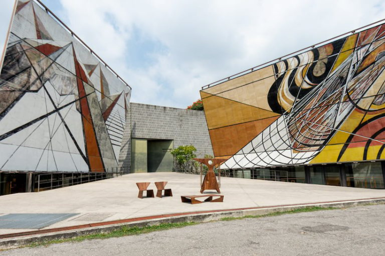
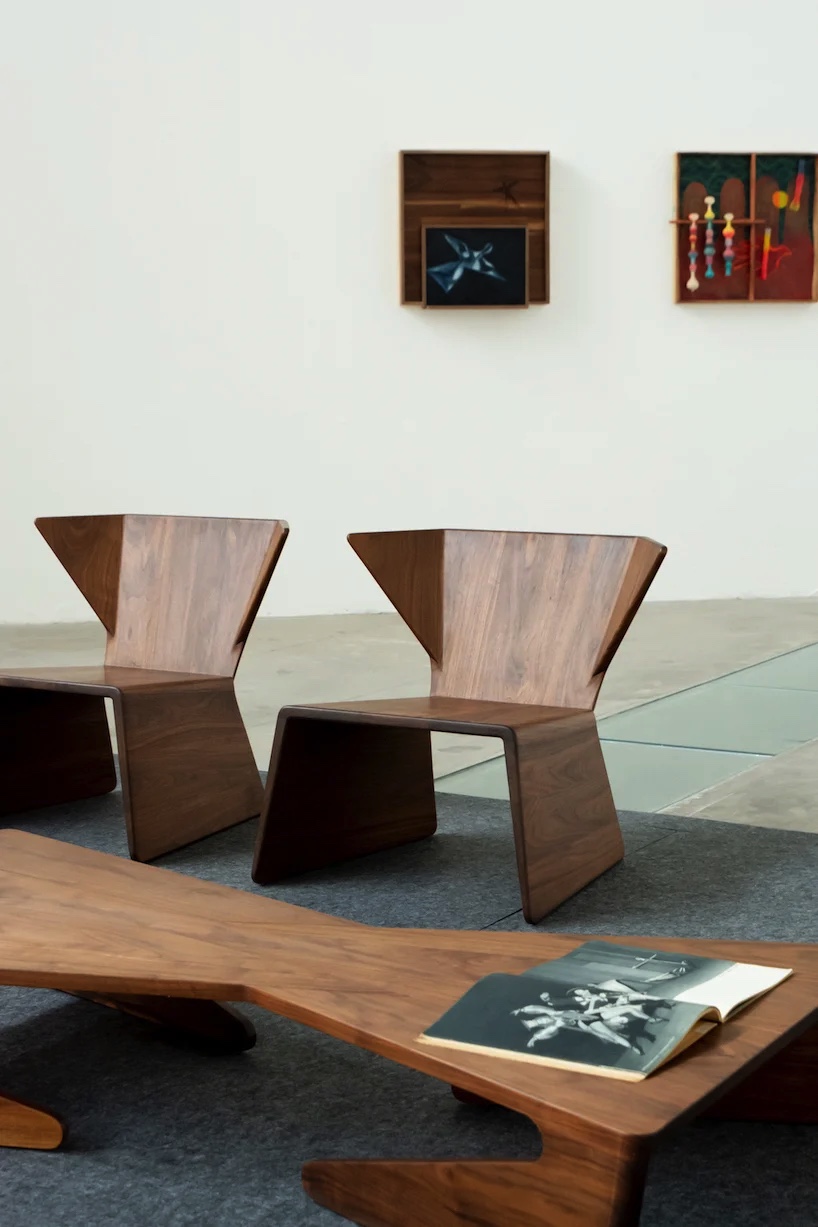
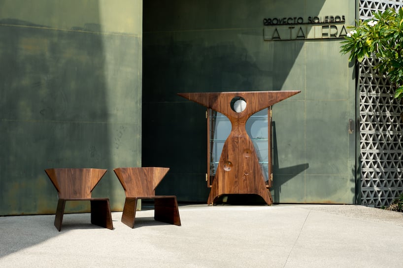
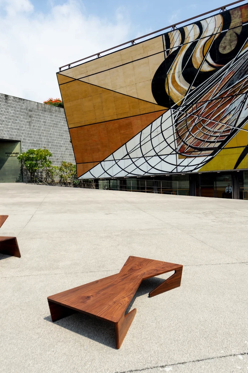
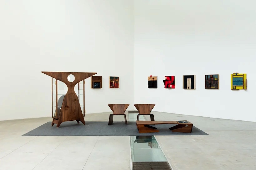
Exploring the convergence of sculpture, dance, and architecture, the collaborative efforts of artist Edgar Orlaineta and designer Simon Hamui have birthed a captivating collection of furniture objects that pay homage to contemporary aesthetics while embracing the intricacies of the manufacturing process. This ambitious project, titled “Variations on Non-Euclidean,” comprises three distinct pieces: The Ruth Lounge Chair, The Redshift Coffee Table, and the Miss Expanding Universe Bookcase.

Each of these creations draws its creative spark from a multifaceted source. They find inspiration in the groundbreaking work of avant-garde dancer Ruth Page (1899-1991), the architecturally significant residence designed by Howard T. Fisher for Page, and the remarkable sculptures crafted by Isamu Noguchi as a tribute to this remarkable dancer. These distinctive furniture pieces, predominantly crafted from wood, engage in a compelling dialogue with the abstract and geometric mural that envelops the La Tallera space in Mexico, creating a seamless fusion of art, design, and the spatial environment.

Via: Designboom
Designers: Edgar Orlaineta and Simon Hamui

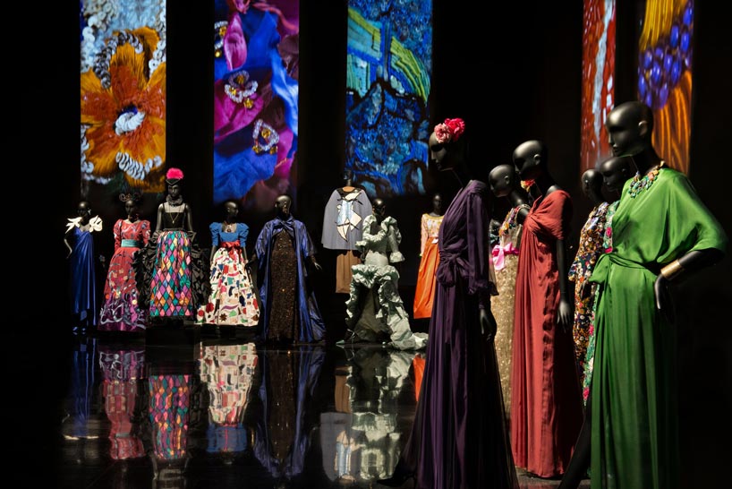
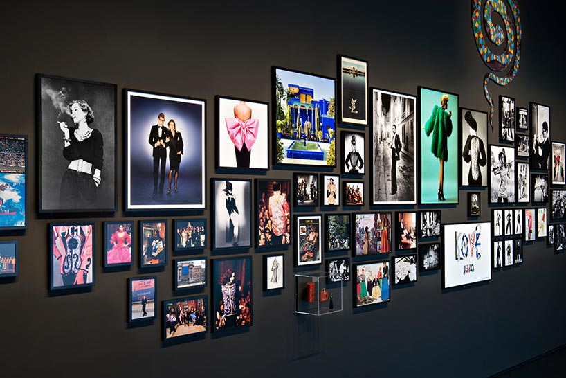
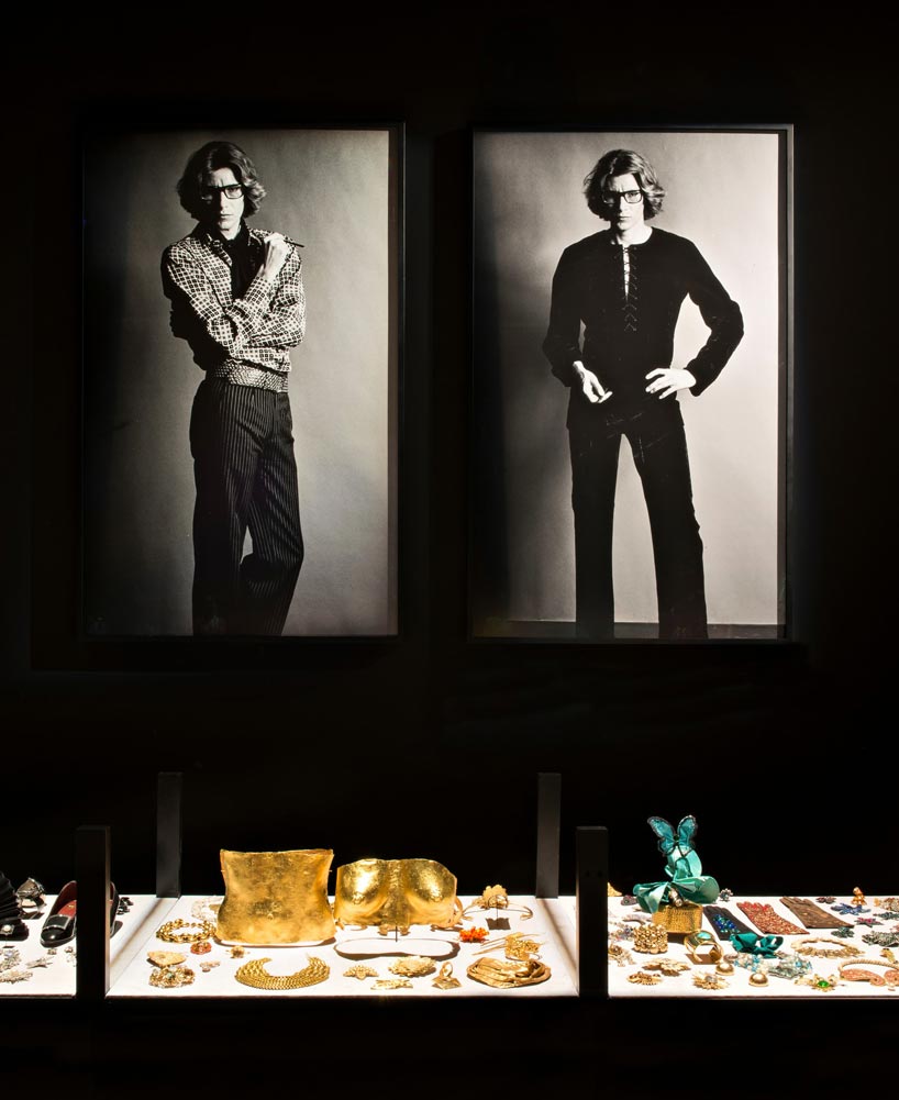
Inaugurated on October 19th, 2017, the Musée Yves Saint Laurent Marrakech (mYSLm) is a dedicated tribute to the illustrious French fashion designer. Nestled in the heart of the vibrant city, this new institution serves as the custodian of an invaluable selection from the Fondation Pierre Bergé – Yves Saint Laurent’s impressive collection, comprising a staggering 5,000 garments, 15,000 haute couture accessories, and a treasure trove of tens of thousands of sketches and assorted objects, all currently housed in the archives of Paris.

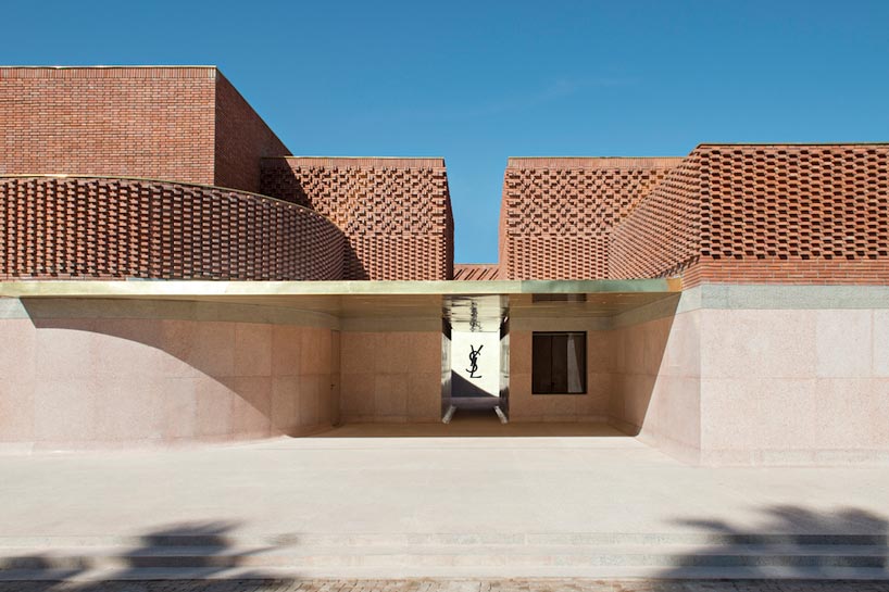
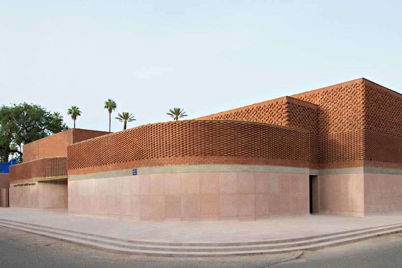
The architectural marvel that hosts this cultural gem is a creation of the renowned French architectural firm Studio KO, founded by Olivier Marty and Karl Fournier. Situated gracefully on Rue Yves Saint Laurent, adjacent to the famed Jardin Majorelle, this new edifice spans over 4,000 square meters of architectural splendor. Within its walls, a 400 square meter permanent exhibition space showcases Yves Saint Laurent’s visionary work in an original scenography meticulously designed by Christophe Martin. Additionally, the museum boasts a 150 square meter temporary exhibition area, a 130-seat auditorium, a charming bookshop, a restaurant with an inviting terrace, and a research library housing an impressive collection of 5,000 books.

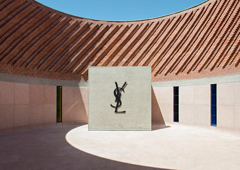
The building’s exterior is a mesmerizing composition of cubic forms adorned with bricks, creating a visually captivating pattern reminiscent of threads of fabric. This outer aesthetic contrastingly gives way to an interior reminiscent of the lining of a luxurious couture jacket – luminous, velvety, and smooth. Constructed from terracotta, concrete, and an earth-toned terrazzo enriched with stone fragments, the building harmoniously integrates with its surroundings. The terracotta bricks gracing the façade are locally sourced, crafted from Moroccan earth.

Notably, the Fondation Pierre Bergé – Yves Saint Laurent has implemented meticulous methods for textile preservation over the past decade, ensuring the conservation of the late designer’s work. The Marrakech museum is equipped with an advanced air conditioning system featuring precise temperature and moisture control to safeguard each item, preserving them in archival condition.

The opening of mYSLm in Marrakech coincided with the inauguration of another museum dedicated to Yves Saint Laurent in Paris. Together, these two museums house a remarkable collection comprising 5,000 clothing articles and 15,000 haute couture accessories. The Parisian museum, located at 5 Avenue Marceau within the former fashion house and current headquarters of the Fondation Pierre Bergé – Yves Saint Laurent, is set to undergo refurbishment for its future exhibition space, further honoring the designer’s legacy.

All images © studio KO, Fondation Pierre Bergé – Yves Saint Laurent

www.studioko.fr
www.museeyslmarrakech.com

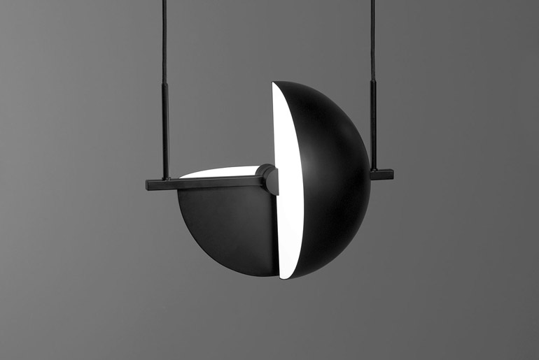
The Trapeze pendadt lamp by German designer based in Barcelona Jette Scheib created for Swedish brand Oblure is as much a single pendant as it is an endless system of possibilities. The square tube has a build in connector which make it easy and fun to mount multiple lamps together. You can connect two lamps next to each other or use a straight and/or 90-degree connector.

“Trapeze is a true artist, an aerialist combining grace and style. Fixed in a single pose with endless possibilities. The solitary performance can be extended to a group by connecting the lamp with one, two or more. The construction allows the user to combine uplight and downlight at the same time.”

www.oblure.com

www.jettescheib.com

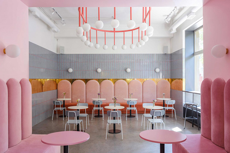
The Breadway bakery and café located in the center of Odessa, Ukraine is a mix of a café which serves breakfasts and lunches as well as a takeaway spot where is possible to buy bakery products to go.

The architects of the projects Lera Brumina and Artem Trigubchak were tasked with creating an inviting, memorable space. It was decided to use a palette of contrasting bright colors and textures. Lera worked on the concept of the interior and its technical part and Artem worked on the realization of the interior.

Space is divided into three parts according to their function. A deep-blue take-away zone, a waiting zone which is located in the center of space in a pink box designed specially for this task, and light-grey zone, where you can stay for a croissant with a cup of cappuccino.

The 85 square meter bakery features high ceilings and large windows. To emphasize the amount of light it was used glossy tiles by Ceramica Bardelli, and to emphasize the height of ceilings, were designed custom-made chandeliers. Built-in furniture, tables, and sofas were also designed specially for this project.

www.lerabrumina.com

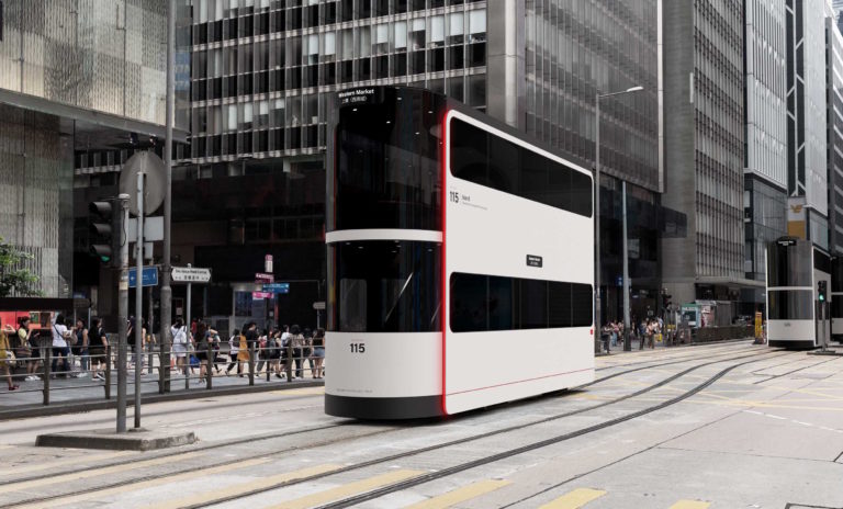
Island by Ponti Design Studio is a double-decker driverless tram designed for the city of Hong Kong in the post-Covid era.

This highly innovative design concept incorporates industrial design, transportation design, public design, urban mobility and sustainability. The project includes exterior, interior and tram stop design. With the Coronavirus pandemic, people are shunning public transport and relying much more on private transport.

We wanted to reimagine public transport in the post-Covid era from a prevention perspective. Especially in the densely populated city of Hong Kong, where social distancing is hard to achieve. The idea of designing a tram is no coincidence: trams are one of the city’s landmarks and the tramways celebrate their 115th anniversary this year. The concept of social distancing, which limits people’s freedom to move and interact became the design challenge and focal point for the new concept.

The name Island references the innovative design of the interiors, where large circular benches facilitate social distancing and passengers sit facing outwards in a radial pattern. The exterior design is inspired by the Hong Kong urban landscape, which features vast surfaces of glass and rounded-corner buildings. Natural light floods the interiors during the day through the curved windows and a domed top, which also provide awe-inspiring views at night. The driverless technology optimizes the interior space of the tram, making it easier to manage travel times and increase onboard safety. The tram has a retractable connector for rapid charging at tram stops. Large vertical LEDs enhance visibility in all weather conditions. The interior design contrasts with the exterior. Minimalist design, charcoal black walls, soft circular seating, wooden floors and trims with natural finish all create a neutral and friendly environment.

This chromatic diversity, in addition to the dark color palette, frames and accentuates the beauty of the Hong Kong urban landscape. The simple tram stop structure has sleek, essential lines. Being open on both sides, it facilitates a linear, orderly flow of people and a healthier environment. The graphics guide passengers through the boarding and payment process, made by Octopus Card, before boarding. This streamlines the boarding procedure and optimizes the available space inside.

Island explores a wide spectrum of design aspects, from the product to the urban landscape. It represents the forward-thinking spirit of Hong Kong, and introduces a new concept of public transport that overcomes the practice of social distancing. We shouldn’t be dividing and separating but instead rethinking public spaces with a seamless, integrated and effective design approach.

www.andreaponti.com

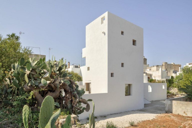
Lorenzo Grifantini, director of London-based firm DOS Architects, has designed his family home in a quiet village in the heart of Salento, Italy. The residence is called La Torre Bianca or The White Tower in English, due to its white tower that overlooks a large courtyard.

The White Tower house is located in Gagliano del Capo, a quiet village in the heart of Salento, the southernmost region of Apulia that stretches at the ‘heel of Italian boot’ in south-eastern Italy The house is located within a dense urban context in the proximity of the historic town centre and along a footpath, named Ciolo, that links Gagliano to the sea.

From inception, the design of the house sought to establish a dialogue to the existing urban fabric. The design of the house reflects the relationship between the openness of the pedestrian streetscape and the privacy of the daily family life The fabric, while occupying all the available area (780 sqm footprint), establishes a balanced equilibrium between the interior spaces and the exterior patio.

Following the tradition of the Roman domus, the aggregated volumes of the house overlook an internal courtyard. The interplay of solid and voids also produce a network of smaller patios that intimately connected single rooms to the exterior. The central courtyard, however, is the real heart of the house, a place of conviviality a. play, where the swimming pool and the carefully selected vegetation reproduce the presence of natural elements.

Overlooking the patio, a 12m high tower where all the main bedrooms are located. The tower is in line with the bell tower of the church of San Rocco and, while hosting all the bedrooms, it offers suggestive visual access to the sea. This element is reminiscent of the Norman watchtowers, a typical and fascinating element of the coastal landscape of Salento.

The architecture of the house is deliberately austere to allow the natural elements to naturally fill the space. The interplay of light and shadow onto the white surfaces of the volumes produces an ever-changing backdrop to the life inside the house. Each and every element of the house contribute to its cohesive architectural synthesis: the volumes, the canopy, the planters and the interior furnishings embedded in the masonry, the pool and the fireplace dialogue with each other creating a unique architectural block.

This playful exchange between the natural elements and the architecture, the inside and the outside enhances the spiritual well-being of the inhabitants.

www.dosarchitects.com